Canada Mapped by Population

Canada mapped by population. With immigration from around the world—particularly from the Middle East, the Indian subcontinent and Asia— Canada today is currently experiencing a population boom that’s reshaping the country.
Mapping Canada by Population
What’s in a map?
More than you might think.
One of the recurring themes on The West Wing, one of the most renowned and rewarding television shows of all-time, is what Secretary of State Leo McGarry calls “Big Block of Cheese Day.” As McGarry tells us, year after year, Andrew Jackson had a big block of cheese in the main foyer of the White House when he was President, so anyone hungry could come and have something to eat, and in that spirit, once a year the fictional White House Staff take times out of their busy lives to hear from the little guy.
On one memorable occasion, cartographers demonstrate the vast difference maps can have on the way in which we view the world. Different projections increase or decrease the size of the continents—Greenland can be massive or miniscule, Africa and South America dominant or diminished, Europe and North America can be at the top of the world…or the bottom, if you flip the map. Josh Lyman and C.J. Cregg (Bradley Whitford and Alison Janney) are astonished when an association of cartographers do just that. “You can’t do that!” they insist, but as the cartographers point out…why not? We live on a rotating sphere floating in space…
When it comes to map and mapping the human mind, it’s all a matter of perspective.
And that’s where the idea of redrawing Canada’s own map comes in. With immigration from around the world—particularly from the Middle East, the Indian subcontinent and Asia— Canada today is currently experiencing a population boom that’s reshaping the country.
North
Click here or on the map for the larger picture
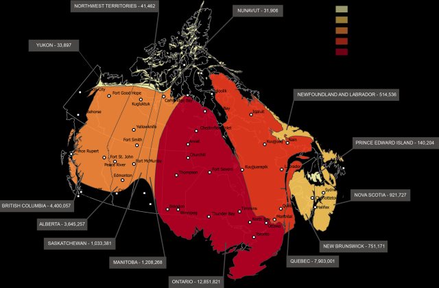
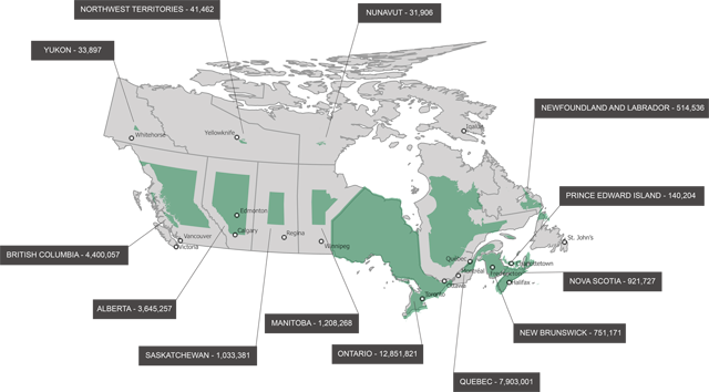
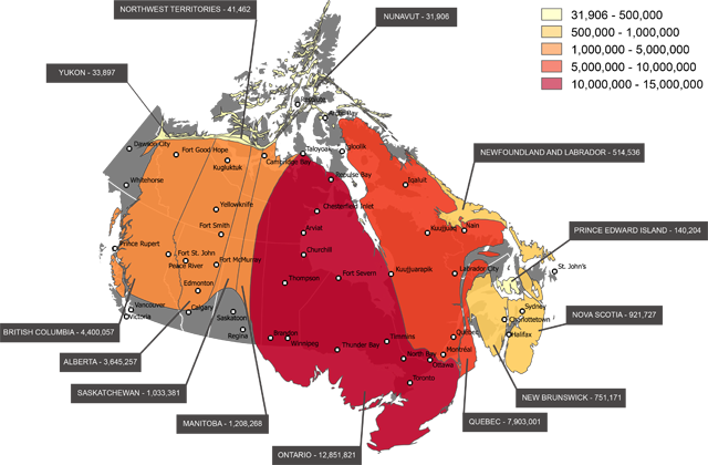
If there’s somewhere immune from that change, however, it’s the most northern and white parts of the Great White North. While the Territories, Yukon, and like areas account for much of Canada’s total landmass, in terms of population it is and historically has been rather sparse and, if adjusted for population, shows up rather “small” on a map. The reasons for this are relatively straightforward. Not a lot of people are clamoring to move to some of the coldest areas in North America and, indeed, the world. Comparing population surveys by the OECD/World Bank between 2006 and 2011, the only area to show a net loss in population are the Northwest Territories…granted, it was a loss of just two people (41,462, down from a whopping 41,464 over that huge land mass) but still. In addition, the Yukon and Nunavut reported the smallest increases in population according to that same survey (3.5K and 2.4K citizens, respectively.)
Northern Canada looks big on a map, but when it comes to population, it comes up small.
South
Click here or on the map for a bigger picture
By contrast, Southern Canada has a population greater than its bounds, and it shows in more places than simply on the map.
Concerning those maps, however, Southern Ontario is absolutely dominant. On the whole, the entire province is the most populous in Canada, has been for some time, and this process is only accelerating. That same OECD/World Bank survey found more than a 600K spike in the total population of Ontario, by far the biggest jump without adjusting for rate or per capita measurements. That said, the rate of change is likewise impressive, as this constitutes a 5.7% bump between 2006 and 2011 according to that survey. Other provinces are also getting in on the act, with Quebec’s southernmost region—home to Quebec City and Montreal—also enjoying huge boosts which would increase their prominence on a population-adjusted map.
So what’s contributing to the continued rise of Southern Canada in general, and Ontario in particular? Simply put, Southern Canada in general and Ontario in particular are bastions of diversity, which means they’re also hot destinations for the immigration boom. Toronto and Hamilton are big players in this, as each attract a great deal of attention from immigrants in the Indian subcontinent and the Middle East.
East
The Northeastern United States in general and New England in particular is a haven to small states and communities, casually liberal while remaining quaint and traditional. Martime Canada follows a similar pattern, as New Brunswick, Nova Scotia and Prince Edward Island look small-but-significant on a map and register that way according to the census as well. While all three of those provinces enjoy growth, it’s under 4%, less than the national average. In fairness, however, Ontario’s 5.7% is also under the national average, albeit just barely, by 0.2%.
West
Western Canada in general and Alberta and British Columbia in particular are likewise huge beneficiaries of the rise in Canadian immigration. The Pacific Coast of North America has long been a hot spot for Asian immigrants, and more recently immigrants from the Indian subcontinent have likewise been transforming the economic and cultural landscape of the region. British Columbia in particular is the proud home to some of the most vibrant Hindu communities in Canada, while Alberta enjoyed the largest increase per capita in our OECD/World Bank survey from 2006 to 2011, as its population rose by an impressive 10.8%, good for 2nd place overall among the provinces.
That said, as that episode of The West Wing showed, it’s all a matter of perspective when it comes to population-based maps. The clincher on that point? While Alberta, one of Canada’s more prominent provinces, was 2nd overall in growth by rate, the #1 slot went to none other than the Yukon, which we’ve already shown is big on land mass but small in actual population. Nevertheless, these trends do show that Canada is, overall, a large and growing country any way you present it.

